To create compelling and visually appealing print and digital media layouts, one must have a design principle, technical expertise, and creativity.
These strategies will allow you to produce appealing, engaging designs that convey your message, whether working on a poster, brochure, website, or social media graphics.
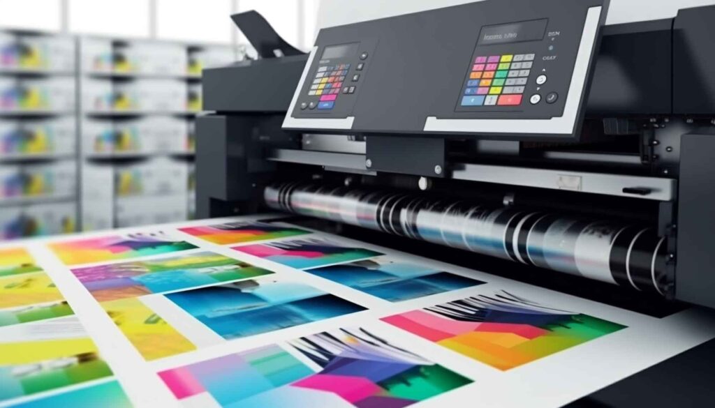
Print design is a division of graphic design that focuses on printed items. This comprises printed materials for creating magazines, book covers, packaging, business cards, flyers, brochures, and other practical printed products.
Designing effective print layouts requires a fundamental understanding of your audience and message. It involves entering the minds of your target audience to understand their preferences, requirements, and behaviors.
Understanding your audience will help you create designs that appeal to their interests and engage them meaningfully. Furthermore, a strong understanding of your message ensures your design achieves its goals.

When working with clients, it’s always a good idea to ask for samples of designs they like or to provide them with different design styles in graphic design. By tailoring your designs to their specific requirements, you’ll be able to provide them with a final product that they’ll love.
Working with various clients will also enhance your experience and enable you to better understand the needs of different individuals and businesses.
In short, understanding your intended audience/client and message will enable you to develop a design that grabs attention and effectively conveys your message.
One of the aspects of design that is often hidden from view is the usage of grid systems. A grid system is essential when creating a layout, regardless of whether you are designing one or hundreds of pages.
Using grids, you can position text and images on a page to give it a polished, clean appearance.
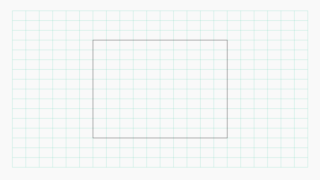
Lines that cross both vertically and horizontally make up the framework. Try including angular or curved lines to make your website more complex. There are no hard-and-fast guidelines defining what constitutes a grid.
You can make your grid as a designer, and that’s the beauty of design. Sticking to it throughout a project will help you produce clean pages.
Trim refers to the final proportion of your printed work after it has been reduced to fit its intended size.
It represents the precise size of your printed document after it is finished. To guarantee that all of your information neatly fits within the proper limitations, you must design your layout using these trim proportions.
Design components, text, and images should all be placed precisely within the trim area if intended to extend to the paper’s edge.
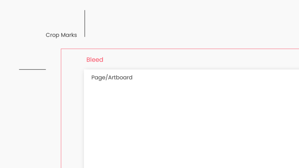
Bleed is the additional space above the trim line that prevents gaps or white edges from appearing after the printed item has been reduced to its final size.
The bleed area should include any design components that go all the way to the edge of the paper (such as background colors, graphics, or patterns).
Using the example of developing a flyer with a trim size of 8.5 inches by 11 inches, You might set up your document with a slightly larger canvas, such as 8.75 inches by 11.25 inches, to account for bleed.
Your bleed area is this additional 0.125 inches (1/8 of an inch) on either side.
If you’re a designer who creates computer designs that need to be printed, you’ll likely come across the term CMYK. This stands for cyan, magenta, yellow, and key color, which are the four primary ink colors used in commercial printing.
By using this color module, you can accurately transfer your computer designs into authentic printed goods that match your original vision.
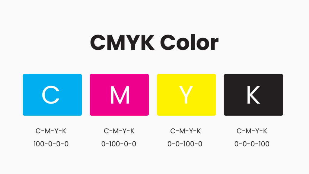
Considering the subtle aspects of ink blending and reproduction, designers can ensure that colors reproduce accurately on the finished printed piece when using CMYK.
This color model is necessary to produce correct and consistent color results in various print media, including brochures, posters, and business cards, which raises the overall standard and gives the printed layout a more polished appearance.
Another essential component of your layout and design is using images and graphics, which provide your publication with more visual interest, appeal, and information.
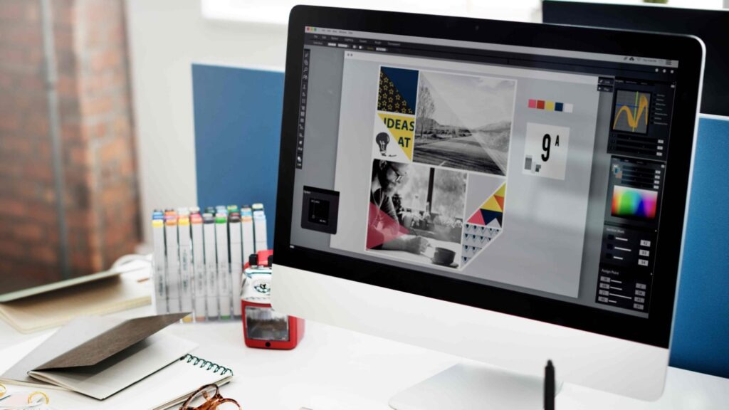
Images in your layout should be appropriate, of excellent quality, and carefully placed. Along with the copyright and credit concerns, you should also consider the size, resolution, and format of your photographs and graphics.
Depending on your objectives and preferred look, you can utilize a variety of graphics, including photos, illustrations, icons, charts, and diagrams.
Pick a color scheme that goes well with your message and brand image. Effectively use color to evoke feelings and improve visual appeal. Make sure the text and background have enough contrast for easy reading.
Check out this helpful guide that can assist you in coming up with color ideas for your branding efforts. Follow the link to gain valuable insights into creating color concepts that align with your business’s branding strategies.
Before sending your layout to the printer, you must proofread and test it as the last stage of print production.
You may identify and fix any flaws, omissions, or irregularities in your layout and design by proofreading and testing it. Double-check your page numbers, alignment, spacing, margins, grammar, and punctuation.
You should test your layout on multiple devices, screens, and paper to ensure it appears beautiful and functions properly in various formats and circumstances۔
Use relevant sketches, icons, or visuals to improve the aesthetic appeal. Keep your visuals’ style and quality consistent to get a unified design.
Discover ways to provide visual contrast to your image to quickly grab your audience’s attention before they have read anything. Using color, typography, shape, and balance can produce the difference.

Think about the audience and the content you want to convey through your design. When creating a design for a magazine feature, read the content to see if any design ideas immediately come to mind.
When creating a landing page for a brand, please consider the brand identity and develop a design concept that goes with it.
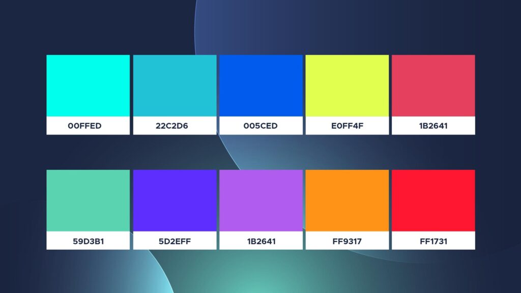
Pick a color scheme that consists of 1-3 primary colors and a further 1-3 secondary colors that contrast and enhance one another.
To maintain consistency, use various shades of the same color while changing brightness for contrast. Stronger contrast will be required to read finer typefaces on a colored background.
Here is a valuable resource that can help you generate color ideas for branding purposes. Click the link to gain insights into creating color concepts for your business branding strategies.
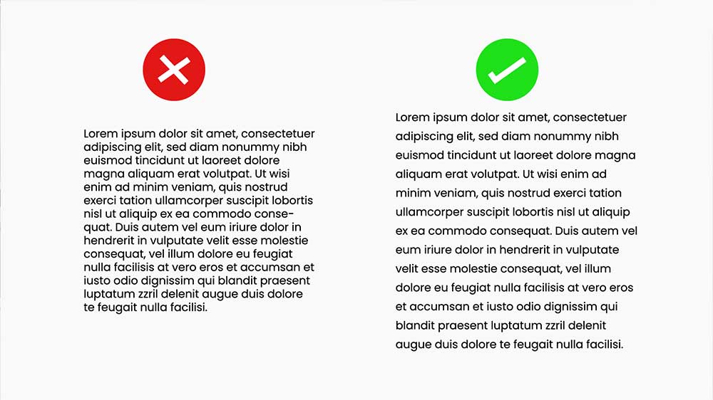
Clear and readable contrast between the bright aqua and the dense green background is preferred to use
Create a fluid layout design by allowing words with white space to let elements breathe. A design is simpler to read with more space around text boxes, photos, and other graphic elements. Compared to a cluttered composition, it is more likely to draw attention.
Find out more about White Space here.
Use digital media design tools to create aesthetic and visually appealing layouts. Tools you can use to create engaging visuals include Canva, Adobe Express, Easelly, Pixlr, and many more.
A style guide gives you a structure and a reference for your designs for digital media; it does not restrict your creativity or stop you from trying out different things.
Experiment with combinations, contrasts, effects, and strategies to add interest and variety to your design.
You can experiment with color schemes, typography, forms, textures, and animations to convey moods, emotions, and messages.
When putting your digital media designs into practice, review and improve them. You must ensure that your design satisfies your objectives and the expectations of your audience by checking it for any mistakes, gaps, or inconsistencies.
You should also assess whether your design conveys your style and independence while being clear, engaging, and memorable.
To preview, edit, and test your digital media designs across many platforms and devices, use tools like Adobe Acrobat or InDesign.