Color Theory
Understanding how color impacts design and how to use color effectively
When creating visually appealing color schemes for user interfaces, designers use a set of principles and standards called a color theory.
The study of color is both a science and an art. It discusses how color is perceived by people as well as the visual consequences of how colors blend, complement, or contrast one another. The signals that colors convey, as well as the techniques for duplicating color, are all covered within the color theory.
Importance of color Psychology in design:
Color psychology is the study of how colors affect human behavior and emotions. In web design, choosing the right colors can influence how users perceive your brand, navigate your website, and ultimately make purchasing decisions. It includes,
Color psychology is the study of how colors affect human behavior and emotions. In web design, choosing the right colors can influence how users perceive your brand, navigate your website, and ultimately make purchasing decisions. It includes,
Emotions
Perception
Symbolize
Emotions:
Different colors have different emotional associations. For example, red can convey excitement, passion, and urgency, while blue can represent trust, security, and calmness. By understanding these associations, you can choose colors that will elicit the desired emotional response from your users.
Perception:
Colors can also affect a person’s perception of a space or object. Bright, warm colors can make a space feel more open and inviting, while cool, dark colors can make a space feel more closed off. Understanding how color can influence perception can help psychologists create a space that is comfortable and conducive to therapy.
Symbolism:
Different colors can symbolize different things in different cultures. For example, in Western cultures, white symbolizes purity and innocence, while in Eastern cultures, white can symbolize death and mourning. Understanding the cultural symbolism of colors can help psychologists work with clients from different cultural backgrounds.
Importance of color theory in design:
Color theory is crucial in graphic design as it gives designers to create effective and visually appealing designs. Understanding the principles of color theory helps designers choose colors and combinations that can evoke different moods, communicate brand identity, improve readability, and establish a visual hierarchy.
Color theory helps in selecting appropriate colors for various occasions. At times, a decision must be made between warm and cool colors. By comprehending the concepts of color theory and color psychology, one can effectively utilize colors in their appropriate context
Color impact on design:
Color is a powerful tool in design and can greatly impact the overall look and feel of a design. It can influence the viewer’s mood, emotions, and perception and can be used to create a specific tone or atmosphere in a design. For example, cool and warm colors.
Warm color:
Orange, red, yellow, and color mixtures of these and related hues are examples of warm hues.
They tend to conjure images of warmth, such as sunlight and heat, as their name suggests. Warm colors are frequently utilized to make huge spaces feel cozier since they visually appear to move closer or forward (much like dark colors). Try painting a large bedroom a warm hue, like terra-cotta or brown, to make it seem cozier if you want it to appear more personal.
Cool colors:
While the cool colors category includes blue, green, and pale purple, they can soothe and quiet. Cool colors provide a contrast to warm hues, which conjure images of water, the sky, and even ice and snow.
Cool hues, as opposed to warm colors, tend to recede, making them ideal for tiny spaces where you want to appear larger. Try painting your little bedroom or powder room a bright color, like blue, to make it appear larger visually if you want to.
Color Harmony:
Color harmony is the arrangement of colors in a way that is aesthetically pleasing to the viewer. There are different approaches to color harmony, but one of the most common is the use of color schemes. A color scheme is a set of colors that are selected based on their relationships with each other. The most commonly used color schemes are
Monochromatic scheme
Complementary color scheme
Analogous color scheme
Triadic Color Scheme
Tetradic color scheme

Monochromatic scheme:
This color scheme uses different tints and shades of a single hue. In a monochromatic color scheme, a single color is used in different tints and shades to achieve a consistent visual appearance as you can see in the attached picture. For example, a monochromatic color scheme might use different shades of blue.
Monochromatic color schemes are frequently used in branding to establish a powerful visual identity for a business or a product. Maintaining a uniform color palette can strengthen the brand’s message and beliefs, as well as convey a perception of competence and dependability
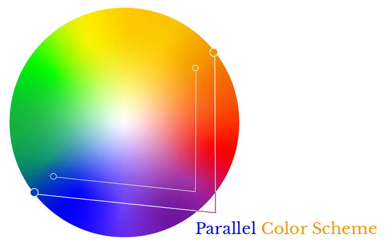
Complementary color scheme:
Two colors that are parallel to each other on the color wheel make up a complementary color scheme see the picture guide for a better understanding of this statement. Some examples are red and green, blue and orange, or yellow and purple. High contrast is produced by complementary hues, which may be utilized to produce a colorful, attention-grabbing design.
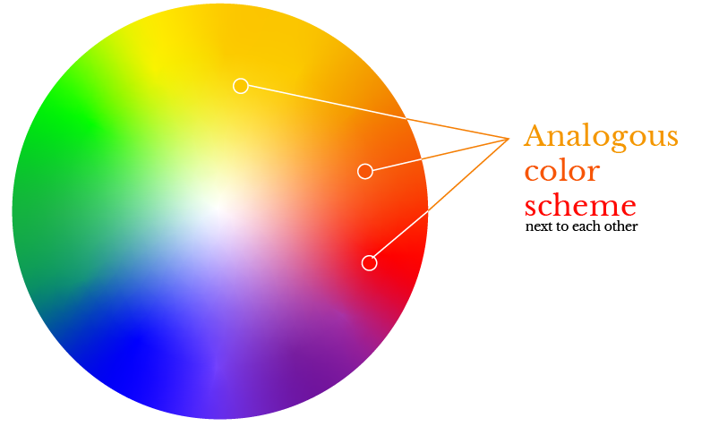
Analogous color scheme:
Three colors that are close to one another on the color wheel make up an analogous color scheme. For instance, red, orange, and yellow, or blue, green, and yellow. A harmonious and cohesive design is produced by using similar hues.
Triadic Color Scheme:
Three equally spaced colors on the color wheel make up a triadic color scheme. For instance, red, blue, and yellow, or purple, orange, and green. A balanced and energetic design is produced using triadic hues.
Tetradic color scheme:
This color scheme uses four colors which are two sets of complementary colors. Four colors are used in the square color scheme, each of which is positioned at equal distances from one another on the color wheel. These four colors are arranged in the form of a square or diamond shape. For example, a yellow-purple and red-green color scheme is tetradic
When creating a color harmony, it is important to consider factors such as the context in which the colors will be used, the emotions and moods that the colors evoke, and the visual hierarchy of the design. By understanding color theory and using color schemes effectively, designers can create visually appealing and effective designs.
Color wheel:
The original color wheel was created in 1666 by Sir Isaac Newton; thus, it predates the one you learned about in kindergarten. Designers and artists still use it to create color palettes and schemes.
He established three groupings by classifying colors in a methodical manner:
Primary Colors (red, blue, yellow)
Secondary Colors (mixes of primary colors)
Tertiary Colors (mixes of primary and secondary colors)
As a result of Newton’s discoveries, the study of color developed to include the characteristics of color in its two manifestations—namely, print/paint and screen/light—as well as in a range of contexts, from art to astronomy. The attributes of a color are:
Hue – Its appearance (e.g., “is green”) is referred to as its hue.
Chroma – If it contains shades (black added), tints (white added), or tones (grey added).
Lighting – How light or dark it seems.
Psychology of Color
It aids in brand identification, communicates the company’s message and values, and builds an emotional connection with the target audience, color theory is vital to branding. In branding, color theory may be applied in the following ways:
Red – The color red represents fervor, enthusiasm, and rage. It may denote significance and demand attention.
Orange – The color orange is associated with levity, liveliness, and friendliness. It inspires energy and is energizing.
Yellow – Yellow might look attention-grabbing or inexpensive, but it also conjures up feelings of joy, youth, and optimism.
Green – Green symbolizes development, stability, wealth, and a closeness to nature.
Light Blue – The color blue in its lightest hue evokes serenity, faith, and openness. It may also represent purity.
Purple – Purple has been used to denote opulence, inventiveness, and kingship.
Pink – Pink is a symbol of femininity, innocence, and youth. It spans from contemporary to opulent.
Brown – Brown gives off a rough, earthy, vintage vibe.
White – White conjures up images of purity, morality, health, or simplicity.
Gray – is the color of neutrality. It might have a quiet, vintage, somber, secretive, or elderly appearance.
Black – The color black inspires feelings of strength, sophistication, edginess, luxury, and modernity.
The psychology of color theory can be applied to a variety of design contexts, including branding, packaging, advertising, and web design. By understanding how colors affect individuals, designers can create designs that effectively communicate their intended message and elicit the desired emotional response from their audience.
Psychology of color in Branding and Marketing
Creating a Brand and Identity:
Colors are used to create a brand identity that is unique and memorable. For example, the color blue is often used by financial institutions because it conveys trust and stability. In contrast, fast-food chains often use red because it creates a sense of urgency and excitement.
Logo Design:
Color is a critical component of logo design because it helps establish brand recognition. A well-designed logo should use color to convey the brand’s message and values.
Consistency:
Maintaining color consistency in branding and marketing is of the utmost importance for creating a recognizable brand identity across all platforms. A unified and recognizable brand identity may be produced by using the same colors consistently throughout all marketing tools, including websites, social media, and print products.
Emotional Connection:
Colors can evoke emotions and create a connection with the target audience. For example, green is often used by environmentally conscious brands because it represents nature and sustainability.
Consider the Brand’s Message and Values:
The brand’s message and values should guide the color selection. For example, a brand that emphasizes innovation and creativity might choose a bold and bright color like orange or yellow, while a brand that emphasizes stability and trust might choose a more subdued color like blue or green.
Research the Competition:
It’s important to research the competition and see what colors they are using. Choosing a color that is too similar to the competition can make it difficult to stand out and create a unique brand identity.
Consider the Target Audience:
The target audience should also guide the color selection. For example, a brand targeting young children might choose bright and playful colors, while a brand targeting older adults might choose more muted and sophisticated colors.
Understand the Psychology of Color:
Colors can evoke specific emotions and create a mood or atmosphere. Understanding the psychology of color can help choose a color that resonates with the target audience and creates the desired emotional response.
Test the Color:
It’s a good idea to test the color with the target audience before making a final decision. This can help ensure that the color is well-received and resonates with the target audience.
Increased Sales:
Color can influence consumer behavior and purchasing decisions. Studies have shown that colors can impact product preference and even affect the perceived value of a product. For example, packaging with warm colors, such as red and yellow, can increase consumers’ appetites and stimulate impulse purchases.
Brand Personality:
Color can also help communicate a brand’s personality and values. For example, green is often associated with environmentalism, while purple is associated with luxury and sophistication.
Advertising:
Colors can be used to create advertisements that attract attention and influence consumer behavior. For example, yellow is often used in clearance sales because it can create a sense of urgency and excitement.
Packaging:
Colors can also be used to create packaging that stands out on store shelves and appeals to the target audience. For example, pastel colors are often used in baby products because they convey a sense of innocence and purity.
Examples of color psychology in branding:
Take Coca-Cola as an illustration. The brand has always been associated with joy, excitement, and enthusiasm because of its distinctive red color.
Or IBM. The B2B juggernaut’s iconic blue color immediately inspires feelings of reliability, security, and trusted brands.
CONCLUSION:
In conclusion, color theory is a fundamental aspect of design that plays a critical role in communicating messages and emotions effectively. Understanding how to use color effectively can enhance the visual appeal of a design and improve the user experience.
To use color effectively, designers must consider various factors, such as the psychology of color and the context of the design. By considering the context in which the colors will be used, the emotions and moods they evoke, and the principles of color harmony, designers can create visually appealing and effective designs that communicate their intended message to their audience.
Popular on MakePixelPerfect
Services
©2024 - MakePixelPerfect - All Rights Reserved.