What is Golden Ratio? How to use it in Design
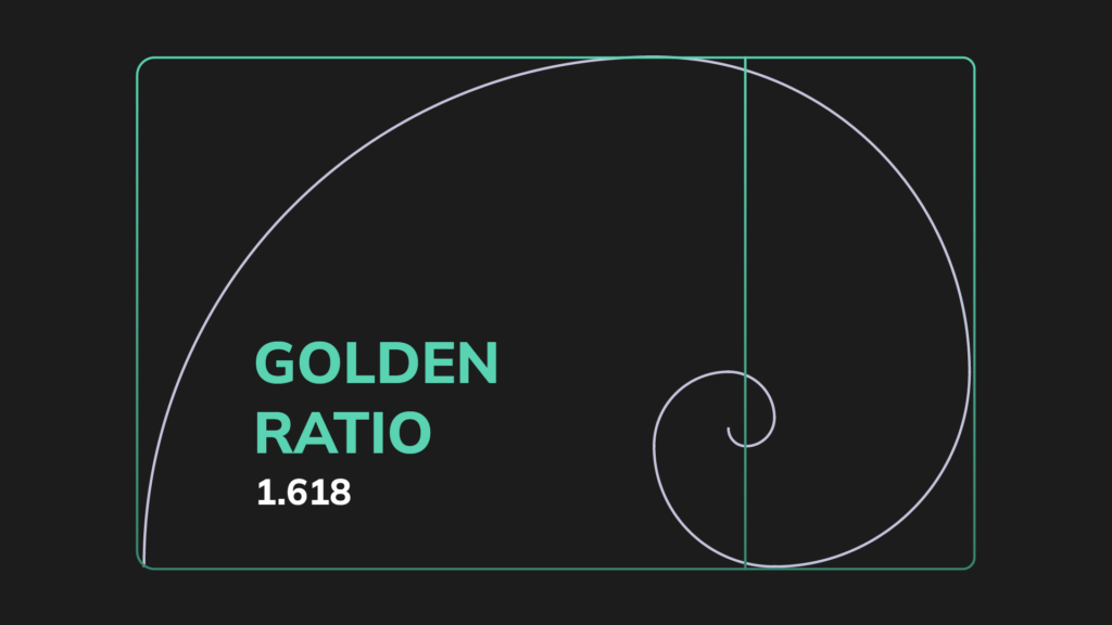
What is Golden Ratio? and How to use it in Design
Introduction:
Art and design are inherently subjective fields. One person’s trash might be another person’s art. But, thankfully, there is an age-old number that may assist your ideas in becoming scientifically-proven works of art: The Golden Ratio.
The Golden Ratio, also known as The Golden Section, The Golden Mean, or the Greek letter ‘phi,’ is a highly useful ratio that may help you build beautiful, perfectly balanced designs that are visually pleasing on a deep cerebral level.
The Golden Ratio is a mathematical ratio found in nature, architecture, painting, and music. When applied to design, it results in an organic, balanced, and aesthetically beautiful arrangement.
What is Golden Ratio?
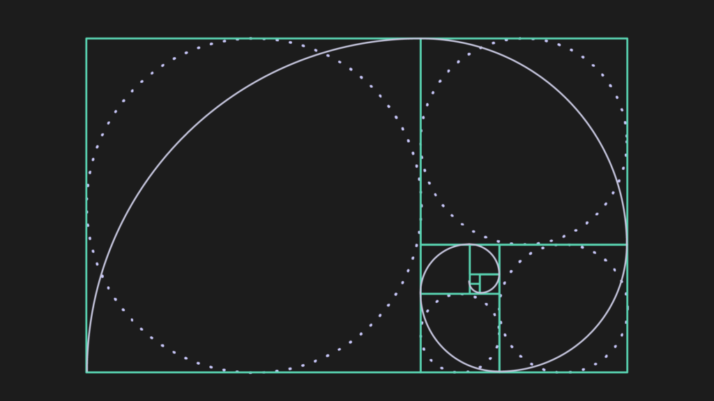
The Golden Ratio is a unique number approximating 1.618, also known as Fibonacci Sequence. The ratio itself is derived from the Fibonacci sequence, a naturally occurring series of numbers seen in anything from the number of leaves on a tree to the form of a seashell.
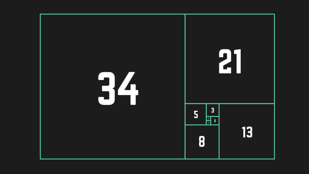
The Fibonacci sequence is the sum of the two preceding numbers. It runs like this: 0, 1, 1, 2, 3, 5, 8, 13, 21, and so on till infinity. The Greeks devised the Golden Ratio from this pattern to describe better the difference between any two integers in the sequence.
How to use Golden Ration in your work?
Aesthetics and design do not follow rigorous mathematical rules. You may develop a bad design that still adheres to the golden ratio.
Still, you can also utilize the golden ratio to inform your composition, assisting you in avoiding clutter and creating an ordered and balanced design.
“Placement is everything on a graphic that might be pretty busy,” explains Jacob Obermiller, graphic designer.
You can use the golden ratio as a reference. The golden ratio can work like the rule of thirds: It can be a compositional convention or guide but not a hard-and-fast regulation about how to structure your work. Ultimately, spacing is important, and any kind of guideline is helpful.
“If everything is important, then nothing is important,” says human factors engineering student Sara Berndt.
If you center every image or arrange text as a single unjustified block, you risk alienating your reader, viewer, or user. Use the golden ratio as a guideline for your work to ensure things are nicely spaced out and well composed.
You may generate diversity and blank space that pleases the eye and makes text easier to digest by using a convention such as the rule of thirds or the golden ratio.
“The golden ratio is all about blank space and its relationship to the ‘pay attention’ space,” Berndt explains.
“People can only accept so much visual information. This is a guiding concept that will assist you in understanding the boundaries of human attention so that you may develop something aesthetically beautiful”.
Using the golden ratio as a foundation for your art or design may help your product seem equal, balanced, and visually beautiful. However, as long as you create wisely and artistically, your ratios do not have to be exactly 1.618.
How to use the Golden Ratio in Graphic design?
One of the most useful aspects of the Golden Ratio is that it provides a basic number to assist in organizing the otherwise illustrative nature of the design. Multiply the size of one element by 1.618 to get the size of another, or use the Golden Spiral to change its location.
You may utilize the Golden Ratio to influence layouts, typography, photography, and other design elements.
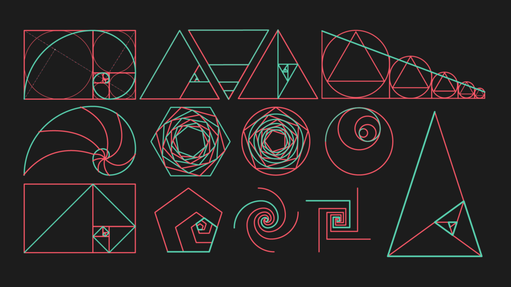
Here are four ways to apply the Golden Ratio in design
Typography hierarchy:
We commonly employ the Golden Ratio in design or photography compositions. However, it may also be used in typography. Here’s how to use the Golden Ratio technique to balance text size and placement. Please choose a size for your body text and multiply it by 1.618.
The final figure might be the size of your headline. So, if you pick 12 pt for the body text size and multiply it by 1.618, the result is 19.416, but you may round it up to 19 or 20. And just like that, you’ll have the desired harmony.
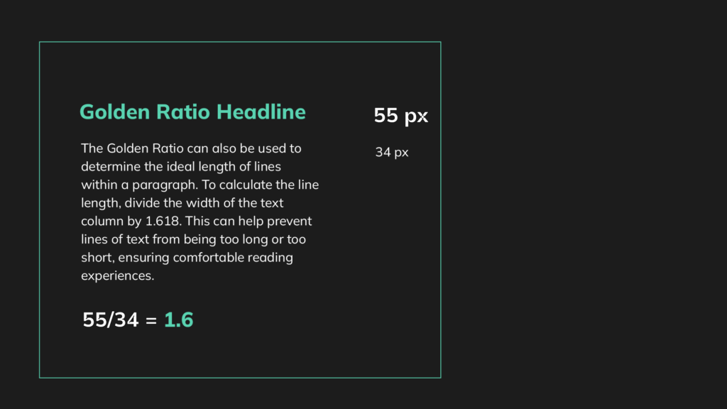
You may also do it the opposite way around. Begin with the headline and then determine the size of the body content. This implies you’ll split the size of the header by 1.618. The organization and structure of your content are equally important in design, whether for your website, adverts, blog, or printed materials.
Layouts:
Placing the components on a layout while maintaining the necessity of space and overall composition balance is critical to creating a nice UI that everyone appreciates. When you use the Golden Ratio rule, you may make your job simpler.
Many websites use the basic two-column style. The key is to understand how to make it seem nice and where to put the relevant information. So, rather than creating a grid that will aid in the placement of your pieces, you can use the golden rectangle as a guide.
Sizing and cropping images:
Naturally, cropping pictures (or any other images you may use) into a golden rectangle form is easy to incorporate the golden ratio into a design. Again, this does not imply you should do it for every photo, but it may be worth considering for an image that is particularly important to your design.
When cropping photos with the golden ratio in mind (particularly when working with photography), you may also want to consider utilizing the golden spiral as a guide for the shot’s composition.
For example, you might crop a photograph to golden proportions such that the image’s main focus point is at the center of the corresponding golden spiral. It adds interest in a similar way to the rule of thirds, but many people think it’s a more natural-looking, aesthetically attractive alternative.
Applying the golden ratio to the proportional size difference between two distinct pieces—even items that aren’t “golden” forms themselves—can be an easy way to include it in your visual designs. For example, suppose you had a 2-inch wide image in your design and wanted to match it with a smaller image.
A 2-inch picture split by 1.618 is around 1.236 inches, which you may safely round down to 1.2 inches.
You may also include a larger image in the design, which would involve multiplying your 2-inch photo by the golden ratio to get 3.2 inches, and now you’ve got a Fibonacci series going, which adds even more interest.
Golden Ratio in Logo design:
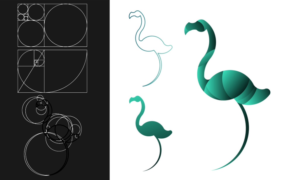
A well-designed logo is essential for your company since it allows customers to comprehend your key message at a look. That’s why it’s a good idea to use the Golden Ratio when developing a logo to attract people and help them connect.
In reality, many of the world’s most recognizable businesses, like Pepsi, Apple, and Twitter, use the Golden Ratio to create logos.
For example, The Twitter logo is made up of perfect circles that follow a special ratio called the Golden ratio. This simple design is easy to recognize. Interestingly, the grid used to create the logo is actually quite complex, which is unexpected.
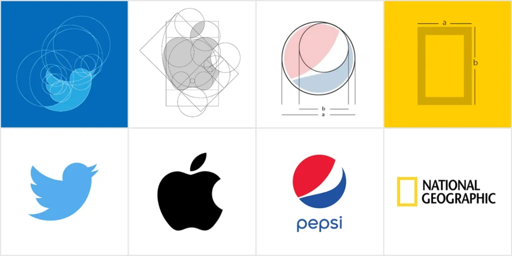
For more info about Golden Ration in Logo Design, visit ZekaGraphic.
You may even visualize the Fibonacci sequence as a set of circles, then rearrange them to make a grid as the foundation for your logo design when developing one. Many logos, like the Twitter bird, are based on this.
Spacing: Layout with the Golden Ratio diagram
Spacing is an essential component of any design, whether negative or positive space is used, and it may frequently make or break the final outcome.
Determining element spacing can be time-consuming; instead, start with the Golden Ratio graphic and allow the squares to tell you where to position each piece.

This will guarantee that your spacing and proportions are calculated rather than ‘instinctual,’ since slight adjustments to achieve the Golden Ratio can make all the difference.
Content: Trace the Golden Spiral
The Golden Spiral can be used as a guide to decide content arrangement. Our eye is naturally pulled to the center of the spiral, where it will seek details; therefore, center your design on the spiral’s center and put regions of visual appeal within the spiral.

It moves on to the menu buttons, then the logo in the top-left corner, before coming to rest in negative space, absorbing all the information it requires.
As the spiral unfolds, the content grows denser in this graphic identity for Saastamoisen säätiö. As the eye moves closer to the spiral, the size of each letter and the gap between them shrink. The letters do not have to be read in order, but there is enough repetition to become familiar.

Forms: Golden Circles
The Golden Ratio, which may be used to generate squares and rectangles in proportion to each other, can also be used to construct circles. A perfect circle in each square in the figure will have the same ratio as the circle in the next square.
Tools to help you use the Golden Ratio in your designs:
Golden Ratio Calculator: Determine the Golden Ratio by calculating the shorter side, long side, and total length of the two sides.
GoldenRATIO: Designed for designers and developers, this tool makes it simple to create websites, interfaces, layouts, and more using the Golden Ratio. It has an in-built calculator with visual feedback as well as capabilities to save screen location and settings, so you don’t have to re-arrange the Golden Ratio for every activity.
Atrise Golden Section: This useful add-on allows you to set a golden proportion grid directly over your design program of choice, allowing you to measure your design based on the golden ratio.
Although the most recent version of Photoshop includes golden ratio and spiral overlay options, this tool is handy if you’re using an earlier version or different software.
Golden Calipers: As the print is a tangible medium, you might wish to pick up a set of golden calipers–a measurement instrument intended specifically to assist you in designing in accordance with the golden ratio.
Phi Matrix: This computer software for Windows and Mac allows you to apply golden ratio rectangles to any image you create on your computer using any software, including your web browser or word processor.
GoldieApp is designed for artists and designers who wish to see if their work is Golden Ratio compatible by overlaying overlays over their works.
Calculator for the Golden Ratio in Typography: Remember how could determine the font size you use in your designs or on your blog? There is a tool for it. Enter the font size, content width, or both to obtain Golden Ratio Typography.
Remember this number: 1.618:
This number has become your new best buddy. If you multiply a font size or a design element by the Golden Ratio, you’ll be one step closer to seeing your layout come together.
Alternatively, you might use the Golden Spiral as a guide. Because of the Golden Ratio’s scientific, even universal character, designers frequently employ it without realizing it. However, it’s always a good idea to double-check your ideas to see whether they fall inside the magic of 1.618 so you may take them to the next level of brilliance!
Starting with the Golden Ratio
You’ll see the Golden Ratio everywhere if you know what to look for. The human eye is accustomed to witnessing this enchantment, and we unconsciously respond positively.
As designers, we may make use of this number. Even little changes to how you trim an image or construct a layout can significantly impact how your consumers engage with your design.
-
Generate Vector Graphics from a Detailed Text Description in Illustrator
Generate Vector Graphics from a Detailed Text Description in Illustrator in 2024 The Text to Vector Graphic Generate (beta)…
-
Best Adobe Illustrator Plug-in for Selections
Adobe Illustrator is a powerful tool for graphic designers and artistic professionals. It offers countless plugins that take your…
-
Identify fonts from images using Retype (beta) in Illustrator
Identify fonts from images using Retype (beta) in Illustrator in 2024 Find font from images option is now available…
