How to get color ideas for Branding
How to get color ideas for Branding and Unleash the power of AI Tools
Color may influence customer decisions significantly. Customers first rely on brand colors to decide whether or not they want to interact with and learn more about your brand without even understanding what your product is about.
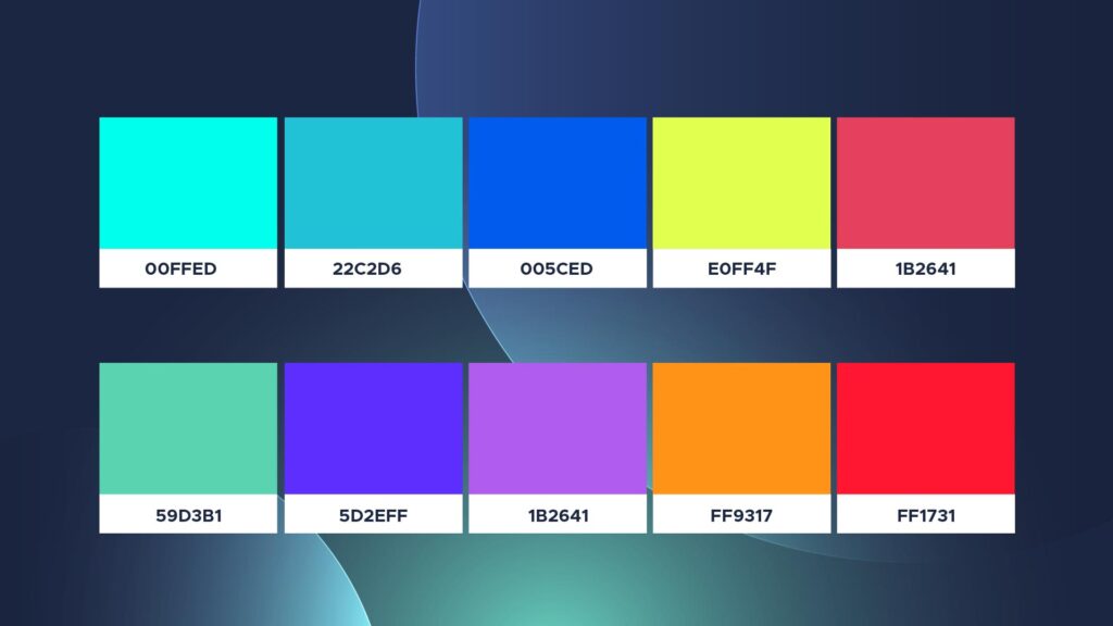
The color scheme you establish for your brand will play an important part across all of your marketing materials, from how you develop a logo and design a business card to how you design your website, and much more.
Using brand colors consistently and across all platforms may give your firm a united appearance and feel, making it distinctive and recognized.
What are brand colors?
A brand color palette is a collection of two to ten colors that are used to represent a certain firm. Consistent and intelligent use of brand colors helps boost brand awareness and recognition.

Brand colors are commonly used in a company’s logo, website color scheme, social media channels, business card design, and print and digital advertisements. For brick-and-mortar businesses, brand colors can also be used in shop design, employee uniforms, product packaging, and other areas.
AI tools to generate colors for brands:
Khroma
Khroma takes AI-based color creation to new heights. Because it has the potential to customize the experience. It analyzes your color choices using a variety of approaches.
It also allows you to block colors that you don’t like and displays colors based on your choices. You may use up to 50 different colors.
Khroma saves AI personalization information. If you are concerned about your privacy, this is an excellent tool. Color palettes may only be researched on one computer at a time. You may save your unique data to a USB drive. Then submit it to Khroma to restore your previous settings.
Coolors
A popular color scheme generator that uses AI algorithms to generate harmonious color palettes. You can start with a single color and let Coolors suggest complementary colors or explore their extensive library of pre-generated palettes.
Adobe Color
Formerly known as Adobe Kuler, Adobe Color is a web-based tool that allows you to create and explore color schemes. It offers various color rules, such as complementary, trio, and analogous, to help you generate cohesive color combinations.
Colormind
An AI-powered color palette generator that generates color palettes based on your preferences. You may start with a single color and the program will create a palette for you. It also allows you to change the color scheme and lock certain colors.
How to choose a color scheme?
Different colors have varied meanings, and it’s a good idea to know what color schemes are often utilized in your business. Even if you’re rebranding, experimenting with a new color scheme may be the best method to modify your company’s image.
Selecting an appropriate color scheme for a brand can be a challenging task, particularly if you lack knowledge of color harmony. Acquiring a deeper understanding of color theory and its principles can prove invaluable in making well-informed and aesthetically pleasing choices for your brand’s visual identity.
Define your brand voice:
Before you even consider colors, you need to have a firm grasp of your brand’s voice. Who are your clients? What commitment do you make to them? What ideals does your brand stand for?
All of these are questions you should be able to answer before deciding on a color palette for your logo.
Picking out the keywords that best define your brand is a smart place to start. If your brand’s keywords are “earthy,” “organic,” and “peaceful,”.
For example, you can choose greenish tones that represent nature, earthy, and peaceful as in the given image copy the color codes and save them in your swatches for future use, and avoid using bright colors like reds and oranges.
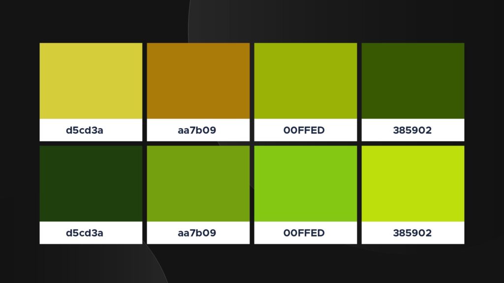
Remember that there is no hard and fast rule that states you must choose a color palette whose meaning exactly suits the brand, but you should avoid choosing colors that are completely opposed to your company’s keywords and values.
Study your competitors:
Look for color ideas as a final step before creating your brand colors. Examine your rivals’ palettes and attempt to figure out what makes them so effective. Consider what you can learn from their color selections and how you can set yourself apart from the competition.
Learn how brand colors influence your visual identity: What are the brand colors used by your direct and indirect competitors? How do their brand identities come across?
Examine brand reputations: Examine audience reactions to each competitor’s visual design and branding decisions. You may accomplish this by exploring forums and brand review pages and distributing a survey to each of your audiences.
Look for trends in their content: What color palettes do your rivals often utilize with different sorts of content? Which brand colors appear to correspond best with marketing, sales, and HR content?
Choose your differentiators: What distinguishes your brand from the competition? Take notice of the variations in their content, tone of voice, and messaging, and explore how those distinctions may be conveyed with color.
If your product is sunscreen, you may notice that many sunscreen manufacturers choose lighter colors such as yellow, white, pink, and blue. These colors represent the fact that sunscreen is frequently worn in bright, sunny locations around or in a body of water.
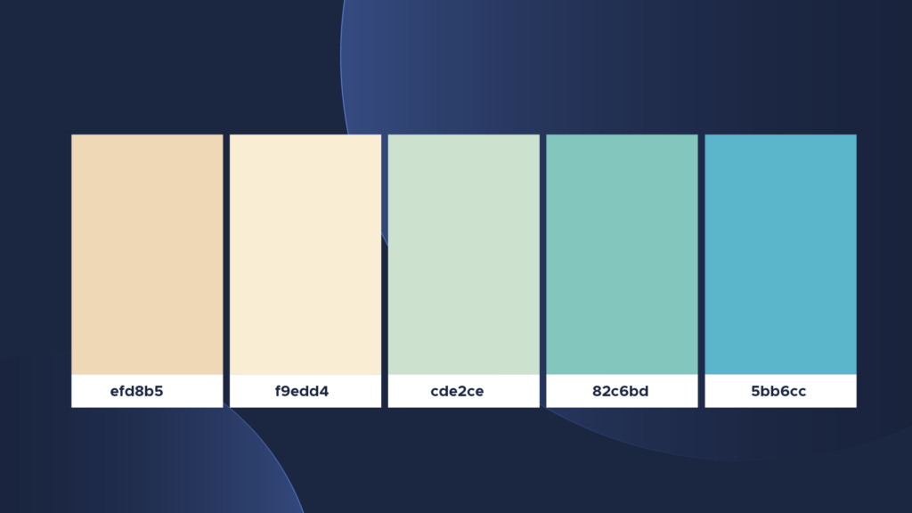
However, if your sunscreen product looks exactly like everyone else’s, it’s simple to ignore it. Instead, evaluate how your sunscreen differs from others.
Is your sunscreen produced in a sustainable manner? Is it good for the environment? If so, green is a wonderful brand color to utilize as your primary color or as part of a color palette.
Color Psychology
Color psychology is the study of how different brand colors influence people’s perceptions and behavior. The science behind brand color theory helps us to understand color and utilize it to our advantage in branding and marketing, from brand color meanings and symbolism to their influence on customers.

Every brand color has a narrative behind it, and that story may impact the mood and impression of your customers.
Red- represents passion, excitement, and rage. It can denote significance and compel attention.
Orange- The color orange represents liveliness, vigor, and friendliness. It is energizing and energizing.
Yellow- inspires enthusiasm, youth, and optimism, yet it may also appear attention-grabbing or inexpensive.
Green- conveys stability, wealth, expansion, and a sense of connectedness to nature.
Light Blue – A light blue expresses calm, trust, and openness. It can also represent innocence.
Dark Blue – The color dark blue represents professionalism, security, and formality. It is mature and reliable.
Purple- may represent monarchy, inventiveness, and luxury.
Pink- represents femininity, youth, and innocence. It spans from contemporary to opulent.
Brown — Brown imparts a rustic, earthy, old-fashioned appearance or attitude.
White- implies purity, morality, health, and simplicity. It can range from low-cost to high-end.
Grey — Grey represents neutrality. It might appear understated, classic, solemn, secretive, or mature.
Black- evokes a strong, smart, edgy, opulent, and contemporary sense.
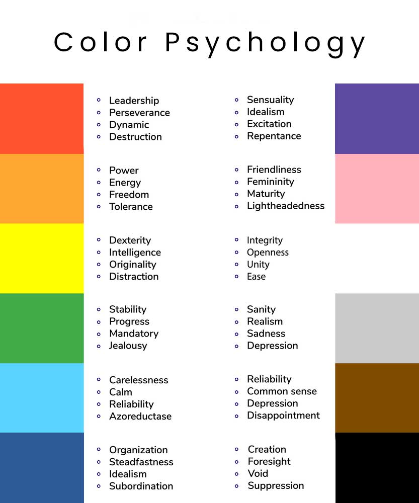
Keep in mind that the impact of your branding colors is determined by the style and manner in which they are employed, as well as the color combinations you select.
This is a condensed version; our relationship with color is much deeper than this—for example, too much yellow may really create worry. If you want to understand more about how color affects emotions and behavior, check out our comprehensive guide.
Brand Color Terminology
It is essential for you to be able to communicate effectively with your design team as a brand manager or leader. If you don’t already know all of the terminology associated with brand colors, do some research and understand the fundamentals.
Using the correct terminology can assist you in increasing speed and accuracy throughout the brand color decision process. Educate your staff so that they may express any opinions or comments they have while you design your color palette.
Here’s a quick breakdown of color terms you should know:
Color Hues are variations on the main hues of red, yellow, and blue. As you may recall, depending on how they are blended, these three colors may produce any other hue.
Color Shade: When black is added to a color, the quantity of shade relates to how much black is applied.
hue Tint: This is the white form of shade, with white added to lighten the hue.
Color Saturation or Tone: This is when you modify the look of a color by combining black and white.
HSL Color Codes: HSL is an acronym that stands for hue, saturation, and lightness. To express the degrees and percentages of each, these three color codes are most commonly used in web design.
CMYK and PMS: CMYK is an abbreviation for Cyan, Magenta, Yellow, and Key (black), whereas PMS is an abbreviation for Pantone Matching System. These are used in offset or digital printing.
RGB and HEX: are abbreviations for Red, Green, and Blue, respectively, and Hexadecimal Numeral System. These are usually present on computer displays for things like web pages and emails.
The formula for building a brand color scheme
Here, we’ll outline our approach for creating a color scheme that you can use as a framework as opposed to step-by-step instructions.
Plan on using three colors
You’ll need a base, an accent, and a neutral. Depending on the kind, brand color schemes can contain 1-4 colors (see below), but even monochromatic schemes will require some variation in hues for varied purposes.
Choose the base
Which of your brand’s personality attributes is the most important? Your basic color should not only reflect your brand’s most dominating quality, but it should also appeal to the audience that you’re attempting to attract. The remaining colors will be chosen based on how well they complement this one.
Select your accent
After the base color, your accent color will be the color you utilize the most. This is more difficult than picking a primary color since there are more constraints: in addition to matching a brand personality feature, your accent color must also aesthetically pair with your base color, as well as please your audience.
Choose neutral hues
It’s tempting to focus on the major colors and neglect the neutrals when designing your brand colors. However, neutral colors are significant since they control the majority of your message (for example, the color of your written text) and will show in the backdrop of the majority of your assets.
How to choose brand Colors?
Brush up on color combinations
You may establish a powerful brand color palette for your firm that works every time by using the color combinations below:
Complementary Color
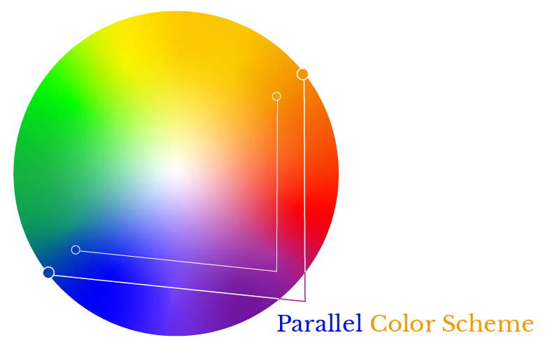
Complementary colors are opposites on the color wheel, such as red and green or blue and orange. This color palette is frequently seen in the food and beverage business, where it shines out on store shelves or street signage (e.g., Fanta, Heineken, Mountain Dew, Taco Bell).
Analogous Color
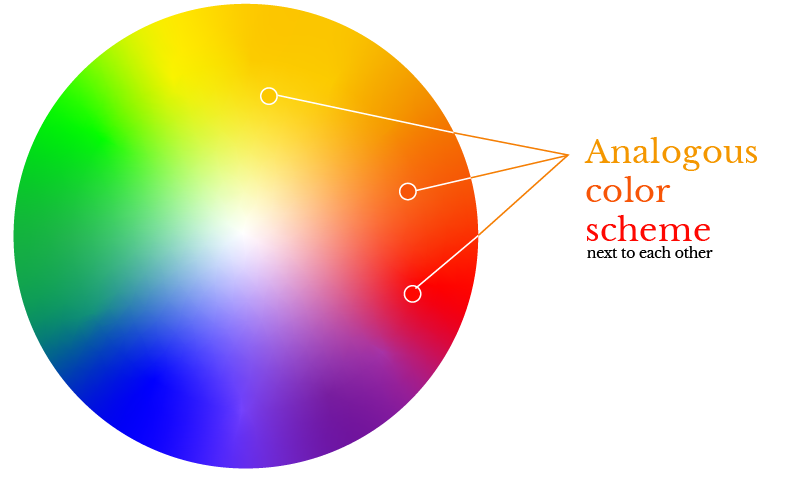
Analogous hues, such as red, orange, and yellow, or blue and purple, are adjacent on the color wheel. A main color, a supporting color, and an accent color are common in analogous brand color palettes (e.g., Mastercard, BP).
Triadic Color
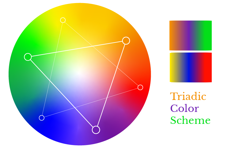
Triadic colors are uniformly distributed across the color wheel and are frequently used to create exceptionally brilliant and vibrant color palettes. Visual contrast and harmony may make your brand stand out (for example, Burger King, Popsicle).
Monochromatic Color
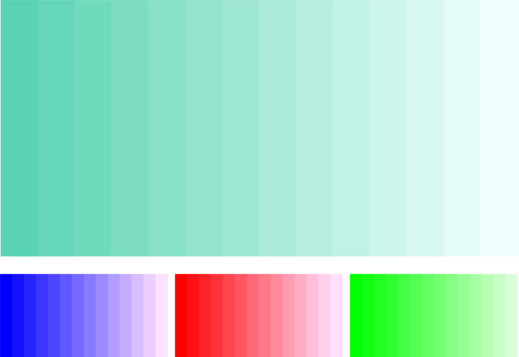
Colors that are monochromatic are diverse hues and depths of the same color. These color schemes may be simple to establish and look quite pleasing (for example, Oreo, PayPal, and Shopify).
Test your brand colors
Once you’ve decided on your colors, combine them and test them in a few different combinations to ensure they complement one another and express the message you intended.
To make your website more accessible, you should also evaluate your palette to ensure that they are plainly visible together. There are several online tools and browser plugins available for testing color contrast for accessibility. We propose the Contrast Checker and Color Contrast Tester tools.
Examples of inspirational brand colors
Starbucks
Starbucks’ brand colors are based on a green family and four neutral hues. Their predominant color is the Siren logo, a well-known hue known as “Starbucks Green.”
This core green, alluding to the brand’s rich legacy, is combined with other “fresh and inviting” colors in the extended color palette. An accent green and two subsidiary greens are included.
Dell
Dell brand colors are classified into three categories. The first tier has the company’s key colors, with the iconic Dell Blue serving as the dominant hue, exuding a “vibrant and energetic” vibe. The three blue tones serve as the foundation for the remainder of the palette.
The second layer consists of three accent colors (purple, berry, and orange) and five neutrals (white and various grays). The third and final layer has three more accent colors. Black is an exception to this palette; it can be used for text or in the logo, but not as a design element.
Related Topics