Follow these Typographers to Improve your Typographic Skills
Follow these Typographers to Improve your Typographic Skills
Typography—an art and a science—is essential to visual communication. Making written language readable, accessible, and aesthetically pleasing requires structuring type in a certain way.
For those who want to become true masters of the craft, references to the works of renowned typographers who have left a lasting impression on the design community can be useful.
This comprehensive guide delves deeply into the lives and works of some of the greatest typographers in history, highlighting their unique contributions and offering valuable insights to enhance our typographic abilities.
Famous Typographers to Improve Typographic Skills
There are the following 12 well-known and famous typographers from the 1500s to the contemporary period are as follows:
- Matthew Carter
- Max Miedinger
- John Baskerville
- Carol Twombly
- Paul Renner
- Tobias Frere-Jones
- Adrian Frutiger
- Jonathan Hoefler
- Jan Tschichold
- Claude Garamond
- Stanley Morison
- Erik Spiekermann
Matthew Carter
| Nationality | British |
| Era | Contemporary |
| Education | Internship at Joh. Enschedé in The Netherlands |
| Foundry | Carter & Cone |
| Famous Fonts Designed | Georgia, Verdana, Tahoma, Bell Centennial |
| Designed for | Time, Washington Post, The New York Times, Boston Globe, Wired, and Newsweek |
Many refer to Matthew as “the most important typography designer” of his era. He was the creative force behind Microsoft’s Verdana, Tahoma, Galliard, and Georgia typefaces and influenced how people read about the world.
He rose to prominence in the digital typeface industry by creating and altering over 40 incredible fonts. He has contributed to prestigious companies like Newsweek, Wired, The Washington Post, Time, and The New York Times.
Topics you may be interesed in
Best Markers for Typography in Graphic Design
How to find fonts from Images?
Understanding typefaces and It’s classifications
Max Miedinger
| Created Typeface | Helvetica |
| Nationality | Swiss |
| Era | Mid-20th Century |
| Education | Kunstgewerbeschule |
| Famous Fonts | Helvetica (with Eduard Hoffmann) |
| Other Skills | Typesetter |
This Swiss-born typeface designer gained fame for designing the innovative, advanced, beautiful, and clear Helvetica font. The Neue Haas Grotesk font was initially developed in 1957.
It was renamed Helvetica later in 1960 and quickly gained international recognition as a symbol of achievement.He worked in Globus’s advertising department before creating Helvetica. In 1956, he thought to become a freelancer and began collaborating with Edouard Hoffmann.
John Baskerville
| Nationality | British |
| Era | 18th Century |
| Famous Fonts | Baskerville |
| Other Skills | Printing, paper, ink production, letter designer, stonecutter, writing, type founder, lacquer work and papier-maché |
John Baskerville designed the clear, well-defined Baskerville font. Baskerville was captivated by experimenting with letters. In 1754, he designed the Baskerville font, and in 1757, he published a significant Virgil edition.

He gave the elegant Baskerville font a classic makeover in his own unique style, which has made it incredibly well-liked and timeless. This font provides readable text both in print and online mode.
Carol Twombly
| carol | twombly |
| Nationality | American |
| Era | Contemporary |
| Education | Rhode Island School of Design, Stanford University |
| Famous Fonts | Trajan, Myriad, Adobe Caslon, Chaparral and Charlemagne |
| Designed for | Adobe |
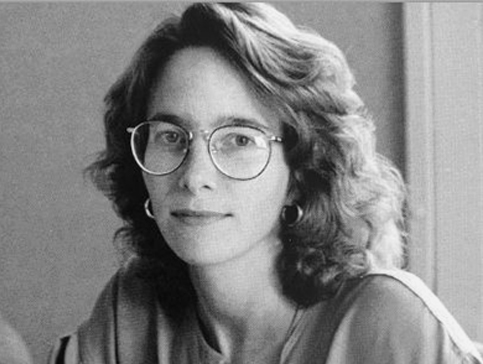
One of the most well-known typographers working today is Carol Twombly. She is an American designer who is responsible for several well-known Adobe fonts, such as Charlemagne, Trajan, Chaparral, and Caslon.
Twombly began working at Adobe in 1988. Trajan was among her first projects at Adobe. In order to create digital fonts, Twombly carefully studied historical scripts. She was successful in 1989 in translating Roman inscriptions from stone carvings on Trajan’s Column into a modern digital design.
She then translated Carolingian versals, or ornamental capital letters, into a digital typeface named Charlemagne (also in 1989), drawing on her experience as a calligrapher and her interest in paleography. Furthermore, she thoroughly studied the popular eighteenth-century William Caslon typeface when creating the modern digital version of Adobe Caslon.
Her first entirely original typeface design, the sans-serif Myriad, was a result of her collaboration with Robert Slimbach.
Paul Renner
| Nationality | German |
| Era | Early 20th Century |
| Education | Several Universities |
| Famous Fonts | Futura |
| Other Skills | Author, Painter |
In addition to developing the well-known Futura geometric sans-serif typeface, which is still in use today by numerous typographers, he also established a new set of guidelines for good book design
The Architype Renner typeface is derived from Renner’s initial experimental investigation of geometric letterforms for the Futura typeface; the majority of these letterforms were eliminated from the face’s character set before its final release. Renner’s Steile Futura typeface from 1953 was brought back to life in 1994 as Tasse.
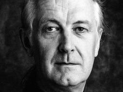
Tobias Frere-Jones
| Nationality | American |
| Era | Contemporary |
| Education | Rhode Island School of Design |
| Foundry | Frere-Jones Type |

He is credited with designing the Gotham font, which is among the well-known brands’ most widely used fonts globally. He went on to become a senior designer at the Boston-based Font Bureau and a Yale School of Art design instructor.
He began working with American designer Jonathan Hoefler after two years of teaching. Both of them contributed to numerous projects during their partnership, such as those for Pentagram, The New Times, GQ, and The Wall Street Journal.
A large collection of Frere-Jones typefaces, like Mallory, which debuted in 2019, had 110 styles and were intended for advanced customers. The Royal Academy of Arts awarded him the Gerrit Noordzij Prize in recognition of his numerous innovations in graphic design.
In addition, he continued to be a recipient of the National Design Award. Tobias has worked on several extremely unusual designs over the past 25 years, such as Whitney, Interstate, Retina, Gotham, Tungsten, etc.
Adrian Frutiger
| Nationality | Swiss |
| Era | Late 20th century |
| Education | Kunstgewerbeschule |
| Foundry | Deberny & Peignot |
| Famous Fonts | Univers, Frutiger, Avenir |
| Fonts used for | London street signage, Paris Metro, Deutsche Bank, GE, Apple |
The Swiss typeface designer (24 May 1928 – 10 September 2015) significantly impacted the development of type design in the second half of the 20th century.
Univers, Frutiger, and Avenir—three of Frutiger’s most well-known designs—are notable sans-serif families that cover the neogrotesque, humanist, and geometric sans-serif typeface genres.
The Swiss typeface designer (24 May 1928 – 10 September 2015) significantly impacted the development of type design in the second half of the 20th century. Univers, Frutiger, and Avenir—three of Frutiger’s most well-known designs—are notable sans-serif families that cover the neogrotesque, humanist, and geometric sans-serif typeface genres.
One of the first sans-serif faces to create a unified yet diverse family across a variety of widths and weights was Univers, which made headlines. Due in part to their greater design complexity than serif fonts, Frutiger referred to the creation of sans-serif types as his “main life’s work.”.
Jonathan Hoefler
| Nationality | American |
| Era | Contemporary |
| Education | Rhode Island School of Design |
| Foundry | Hoefler Type Foundry |
| Famous Fonts | Hoefler Text, Requiem, Archer (with Frere-Jones) |
| Designed for | Guggenheim Museum, Rolling Stone, Harper’s Bazaar, New York Times Magazine |

The 19th-century wood type served as the inspiration for Hoefler’s Champion Gothic. Hoefler started collaborating with Frere-Jones in 1999, and the business followed the name Hoefler & Frere-Jones as a partnership from 2005 to 2014.
With the help of Frere-Jones, the company created the popular Gotham typeface for GQ magazine in 2000.
The typeface has become one of the most well-known in the last 20 years. Hoefler has created unique typefaces for some institutional clients, such as the Solomon R. Guggenheim Museum and the alternative band They Might Be Giants, in addition to Rolling Stone, Harper’s Bazaar, The New York Times Magazine, Sports Illustrated, and Esquire.
The Hoefler Text typeface family, created for Apple Computer and currently included in the Macintosh operating system, is undoubtedly his most well-known creation. Additionally, he created the Church of Jesus Christ of Latter-day Saints’ current wordmark.
Jan Tschichold
| Nationality | Swiss |
| Era | Early 20th Century |
| Famous Fonts | Sabon, Zeus |
| Designed for | Penguin Books |
| Other Skills | Graphic design, Calligraphy |
Jan Tschichold, a revolutionary typographer and significant figure in 20th-century design, lived from 1902 to 1974. Known for playing a crucial role in the modernist movement, Tschichold’s concepts went against accepted typographic conventions
Jan Tschichold, a revolutionary typographer and significant figure in 20th-century design, lived from 1902 to 1974. Known for playing a crucial role in the modernist movement, Tschichold’s concepts went against accepted typographic conventions.
In his groundbreaking book “Die neue Typographie” (The New Typography), he emphasized modern aesthetics and functionality by promoting sans-serif fonts, asymmetry, and clean lines.
Tschichold’s typefaces, like Sabon and Saskia, were examples of his commitment to readability and legibility.
Even though his modernist opinions were initially divisive, his influence was cemented by his useful contributions to book design, which included recognizable Penguin Books covers.
Tschichold’s legacy gained complexity with his later conversion to the appreciation of classical typography. His ability to unite innovation and tradition has left a lasting impression on designers, encouraging them to strike a balance between modern aesthetics and clarity when creating typographic designs.
Claude Garamond
| Nationality | French |
| Era | 16th Century |
| Education | Apprenticed with Antoine Augereau |
| Famous Fonts | Garamond |
| Designed for | King François I |
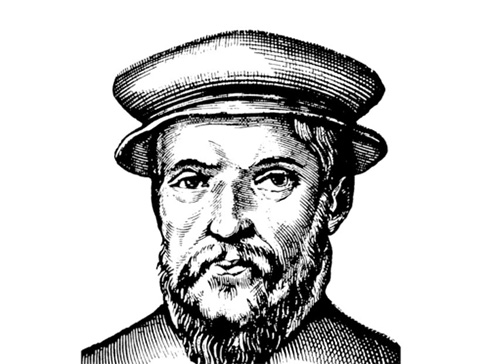
It is among the most ancient typefaces still in use. Reportedly, it originated in France circa 1530. This was an unstable era for French politics and society, requiring new typefaces to express new ideas.
It is among the most ancient typefaces still in use. Reportedly, it originated in France circa 1530. This was an unstable era for French politics and society, requiring new typefaces to express new ideas.
After Garamont’s passing, French and German foundries acquired the typeface, which later returned for use as a font in the 20th century. It is utilized primarily for copy.
French book publishing’s most well-known font to this day. Represented in the Abercrombie & Fitch logo. It is famous for having lighter strokes and having the potential to save the US economy $400 million.
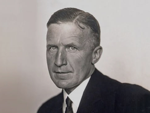
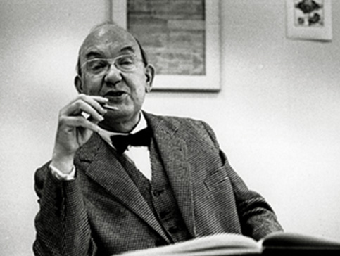
Stanley Morison
| Nationality | British |
| Era | Early 20th Century |
| Education | Self-taught |
| Foundry | Consulted for the Monotype Corporation |
| Famous Fonts | Times New Roman (with Victor Lardent), revival of Baskerville |
| Other Skills | Print Historian |
Born in 1889 in England, Stanley Morison was a British typographer and scholar who played a significant role in the history of typography.

Morison, who is best known for his work with the Monotype Corporation, was essential to the design of Times New Roman, a typeface made specifically for The Times newspaper in 1931..His extensive knowledge of classical letterforms and careful attention to detail helped this typeface achieve long-term success and widespread use.
Morison’s impact went beyond his work on Times New Roman to include his support of conventional and historically aware methods of type design.
His contributions continue to influence how we view and use written language, leaving a lasting impression on the typographic standards of the 20th century.
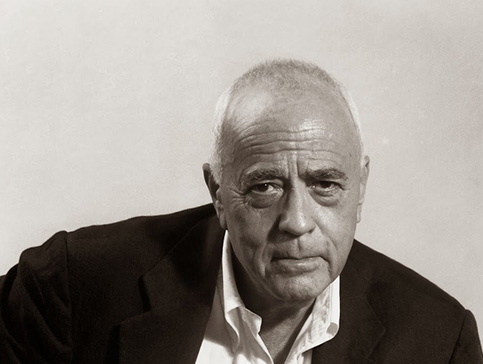
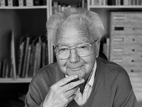
Erik Spiekermann
| Nationality | German |
| Education | Berlin’s Free University |
| Design Firm | Edenspiekermann |
| Famous Fonts | Berliner Grotesk, FF Meta, ITC Officina Sans |
| Designed for | Berlin Transit, Audi, Volkswagen, Nokia |
| Designed for | Graphic design, Letterpress |

Erik Spiekermann created numerous well-known fonts, such as FF Meta, ITC Officina Sans, and Fira Sans.
In addition, he has written multiple typography-related books, such as “Making Fonts: A Typographic Journey” and “Stop Stealing Sheep & Find Out How Type Works.”.
He is well known for his work in typography. Spiekermann is a highly respected individual who has received numerous honours, including the TDC Medal in 2001 and the AIGA Gold Medal in 2006.
Conclusion
The vast field of typography combines creativity from today with historical understanding. By mastering the fundamentals, staying up to date on current trends, and studying the work of accomplished typographers, you can enhance your typographic skills and create designs that are compelling and convincing.
Remember that typography is about more than just words and letters; it’s also about telling stories and conveying ideas through representations.