Responsive Typography in Website Design: Design Type that adapts to different screen sizes
Responsive Typography in Website Design: Design Type that adapts to different screen sizes
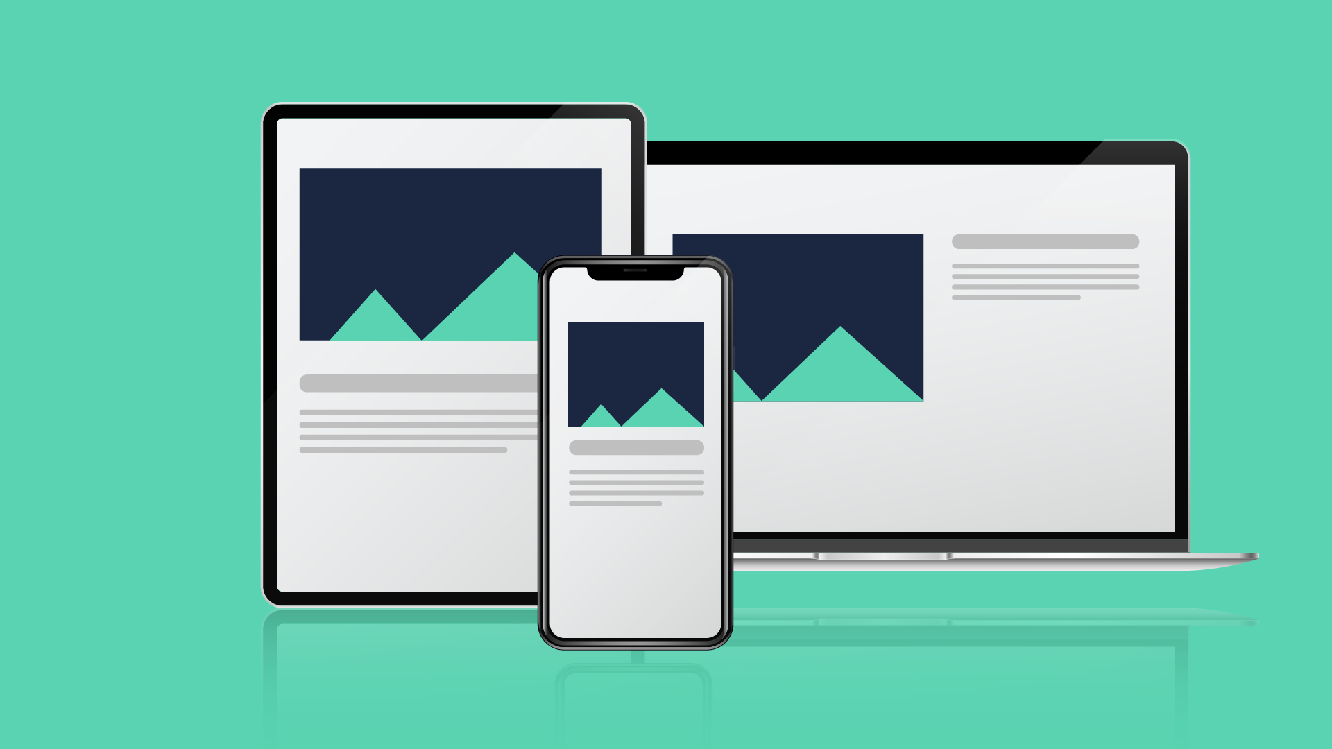
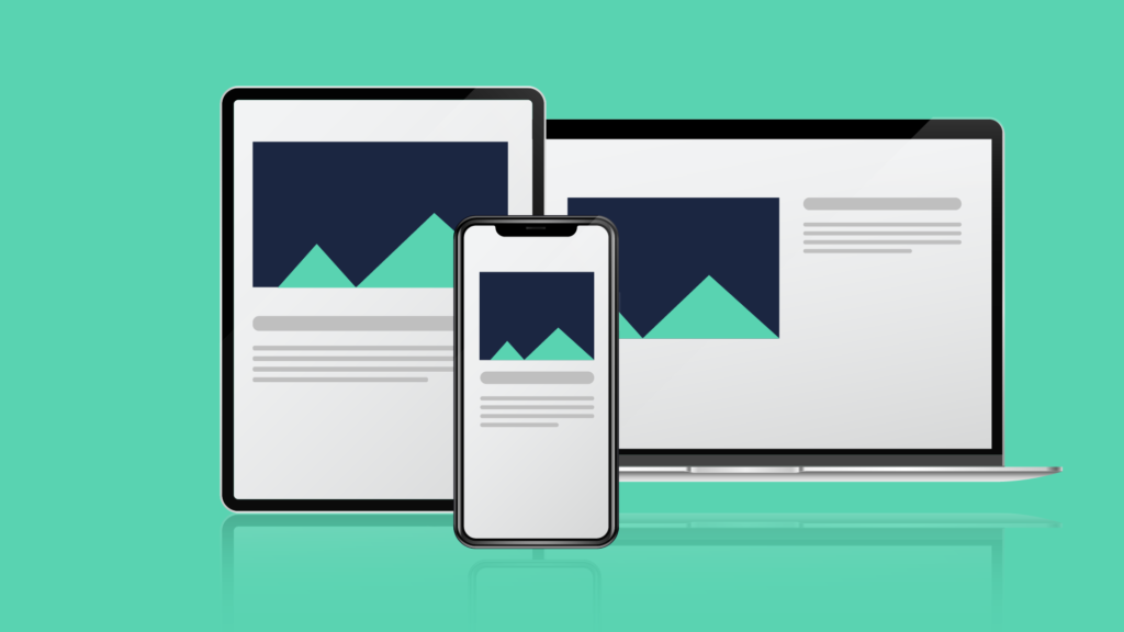
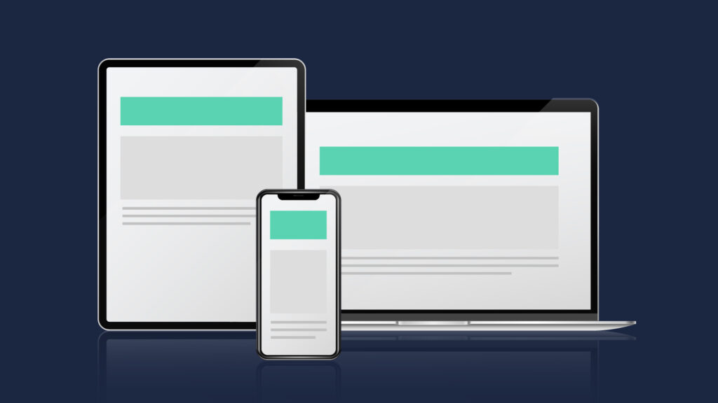
The need for Responsive Web Design is at an all-time high since customers access the internet via different devices with varying screen sizes. As a result, the website must be readable on various devices with many screen widths.
Responsive web design is a means of creating websites that scale and adapt to the size of the screen and the capabilities of the device being used to view the page.
For example, information and graphics resize to suit the screen, and navigation patterns adapt according to the device’s capabilities. As a result, typography must adopt a responsive design to make information legible and appealing on all devices.
Typography
Whereas text establishes the objective and meaning of the copy, typography defines emotions, portrays the brand’s voice, and aids in efficiently communicating the message to people.
Why typography matters?
The art and skill of arranging words on a page or screen is known as typography. It impacts your website’s usability and accessibility, aesthetics, and readability. Typography can communicate your brand’s identity, tone, and message while guiding visitors through your material.
As a result, selecting and implementing the appropriate font for your website is critical.
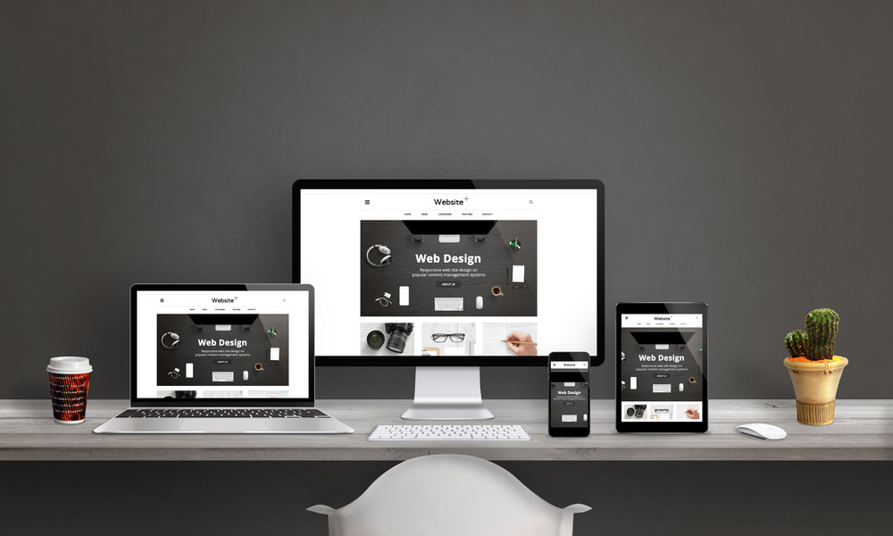
What Is Responsive Website Design?
Responsive website design aims to develop a user-friendly website for individuals who use mobile devices. Smaller displays are found on smartphones, tablets, and other mobile devices.
This implies that graphics and text included in desktop websites with huge screens will not be seen on little screens.
As a result, the site must be modified, particularly to react to the scaling needs of mobile devices’ tiny screens. A website’s design and development must be responsive to the user’s surroundings and behavior based on screen size, orientation, and platform.
A responsive site designer will employ a variety of layouts and adaptable grids in addition to CSS media queries and pictures.
When a user transitions from a bigger screen to a smaller screen on a mobile phone or iPad, the responsive website will automatically adjust for resolution, scripting capabilities, and picture size.
As a result, the website designer employs technology that responds automatically to the preferences of the user’s device. This implies no need to create a new responsive website for each new gadget launched to the market. Flexible website design adapts to multiple screen sizes to increase the consumer base.
Responsive typography design considerations
Responsive typography design considerations include:
Typeface selection: Begin with a typeface that looks good and reads well on a small screen. Then, run it through its paces on a wider screen.
Type possibilities are limited: A smaller palette is easier to handle and lighter in load times.
Consider the following as a backup plan: If your preferred font won’t load (perhaps because the device doesn’t like it or the CDN server is unavailable), consider an extremely common alternative. (Arial is a common sans serif typeface fallback.)
Design size and scale depending on the content: Other factors, such as font choices, can affect readable typography. The scale and size of text components vary based on how much text is produced at once and the type of material displayed on the screen.
Consider line-height: A little additional space between lines might improve reading on mobile devices. There is a fine line between having too much and not having enough room. A line height of 150% or 1.5 em is a decent place to start for smaller sizes.
Fonts: Designers have been more receptive to employing more font varieties – serifs, experimental, and so on – as a normal practice. These can provide some difficulties when tiny or on displays where users may want to utilize dark mode. If you take this way, test type selections early to ensure readability.
Golden Ratio: Using the golden ratio in typography creates visually pleasing designs. By applying its proportions for font sizes, line heights, margins, and spacing, typographic compositions become balanced and captivating to the eye.
Responsive Design:
Responsive web design (RWD) is a method that ensures that web pages appear smoothly on all screen sizes and resolutions while maintaining usability. This is how you design for a multi-device web.
Responsive web design, or RWD, is a design technique that handles a wide range of devices and device sizes, allowing for automated screen adaptation whether the information is read on a tablet, phone, television, or watch.
Responsive web design is a method, not a distinct technology. It is a word that refers to a set of best practices for creating a layout that can react to every device used to view the content.
The recommendation at the time was to utilize CSS float for layout and media queries to query the browser width to create layouts for different breakpoints. Fluid pictures are configured not to exceed the width of their container; their max-width value is set to 100%.
When the contained column narrows, fluid pictures scale down but do not grow larger than their intrinsic size. This allows a picture to scale down to suit its content rather than overflowing it, but not to grow larger and pixelate if the container gets wider than the image.
The Building Blocks of Responsive Web Design
In this part, we’ll review the fundamentals of responsive website design and its many building elements.
- CSS and HTML
- Media Queries
- Fluid Layouts
- Flexbox Layout
- Responsive Images and Media
CSS AND HTML:
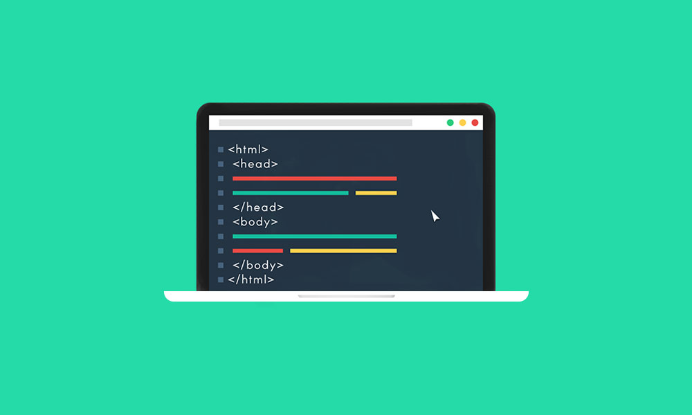
The cornerstone of responsive design is the combination of HTML and CSS, two languages that control the content and layout of a page in any web browser.
HTML primarily governs a webpage’s structure, components, and content. To add an image to a website, for example, use HTML code like this: <img src=”image.gif” alt=”image” class=”full-width-img”>
Using CSS code, you can specify a “class” or “id” to target later. You may also control main properties like height and width within your HTML, but this is no longer recommended.
On the other hand, CSS is used to modify the design and layout of HTML components. CSS code can be incorporated into a document. For instance, we could change the width of all HTML pictures at the element level as follows:
img {
width: 100%;
}
Alternatively, we could put a period in front of the class, “full-width-img” to target it specifically.
.full-width-img {
width: 100%;
}
You may also modify the design in ways other than height, width, and color. When used with a technology known as media query, this is how you make a design responsive.
Media queries:
Simple filters that may be applied to CSS styles are media queries. They make it simple to alter styles according to the type of device generating the content or its attributes, such as width, height, orientation, hovering capabilities, and whether the device is used as a touchscreen.
To provide alternative printing styles, you must target a kind of output; therefore, you may include the following stylesheet with print styles:
<!DOCTYPE html>
<html lang=”en”>
<head>
…
<link rel=”stylesheet” href=”print.css” media=”print”>
…
</head>
…
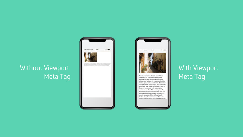
Viewport size:
We can develop a responsive experience by using media queries to apply unique designs on tiny displays, large screens, and wherever in between. As a result, the attribute we detect here is screen size, and we may test for the following.
- Width (min-width, max-width)
- Height (min-height, max-height)
- Orientation
- Aspect-ratio
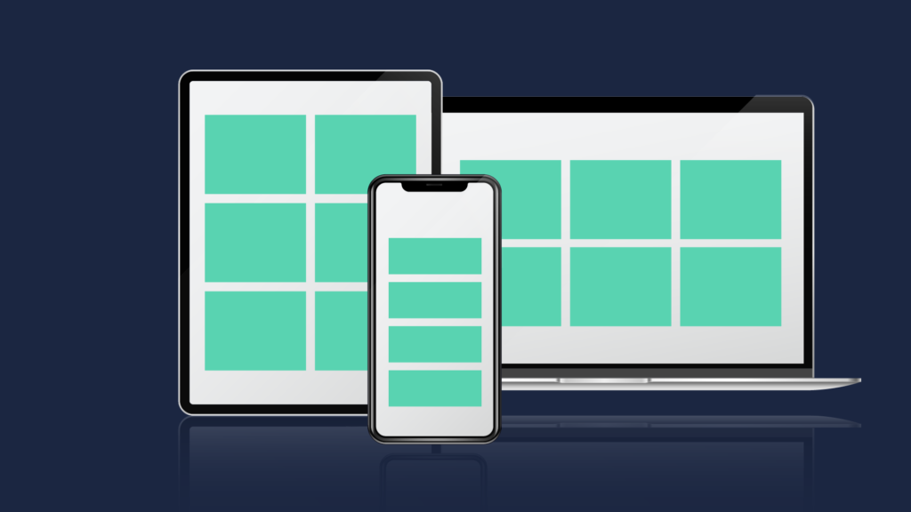
- Fluid layout:
A fluid layout is an important component of current responsive design. Previously, you set a fixed value for each HTML element, such as 600 pixels. A fluid layout, on the other hand, is based on dynamic values such as a percentage of the viewport width.
Based on the screen size, this method will dynamically expand or reduce the sizes of the various container elements.
Flexbox Layout
Flexible Layouts: Responsive design incorporates flexible layouts that adjust and reflow based on available screen space. This can involve using CSS techniques like percentage-based widths, flexbox, or CSS grids to create layouts that accommodate different screen sizes and orientations.
Responsive images and media
A responsive site designer must employ versatile media strategies. This allows photos and other media to be adapted to the needs of various devices. The image is loaded using the CSS overflow or scaling feature.
Scaling is a simple CSS method that is one of the fundamental web design approaches for flexible web pages. The maximum width of the media element is set to 100% by the designer. This allows the web browser to make the picture grow and shrink based on the device and content.
However, designers have the option of cropping a picture using CSS instead of scaling media. The photographs can be significantly trimmed to fit within their containers.
Responsive Type Sizing
The most common sizes are:
- Pixels: A common notation for digital font size that indicates an absolute quantity.
- Points: This is a leftover from print for size that is less frequent online.
- Ems: Size with relation to the parent font size
- Rems: Sizing that inherits root styling
- Percentage: Sizing depending on a parent style’s percent alteration
How does this appear in the default size?
Body text is typically 16px to 18px (1.6rem to 1.8rem for mobile) in size (14px to 16px for desktop). Then, using your preferred scale, size everything accordingly. The scale will cover the rest if you size your body text or other preset font sizes for desktop and mobile.
Choosing the Correct Scale:
A few typical typographic scales provide different feelings and harmonies that are far easier to calculate analytically than arbitrarily assigning numbers to type sizes.
High Contrast Type Scales:
These scales include (number is change ratio):
- Augmented Fourth, 1.414
- Perfect Fifth, 1.500
- Golden Ratio, 1.618
Medium Contrast Type Scales:
These scales include:
- Minor Third, 1.200
- Major Third, 1.250
- Perfect Fourth, 1.333
Low Contrast Type Scales:
The least variable scale is optimal for smaller type elements used as identifiers. This scale may be seen in dashboard-based apps, e-commerce listings, or grid-based features.
- These scales include:
- Minor Second, 1.067
- Major Second, 1.125
Conclusion:
In conclusion, responsive typography is an essential design approach that ensures text adapts and scales effectively across various screen sizes. Properly implementing responsive typography enhances user experience and accessibility, allowing content to be easily consumed on desktops, tablets, and smartphones.
It’s a vital element of responsive web design, enabling typography to adapt seamlessly and provide optimal legibility and aesthetics across the ever-expanding range of screen sizes.