Minimalism vs Maximalism – Which One to Apply to Our Designs
Minimalism vs Maximalism – Which One to Apply to Our Designs
The design ideas of minimalism and maximalism focus on visual appeal. Simple designs with distinct lines and pastel hues are hallmarks of minimalism.
On the other hand, maximalism values strong statements, bright hues, and a variety of textures and patterns. Each strategy has advantages, and the best option will depend on the objectives and target audience of the project.
When choosing which approach to use, consider the intended emotional response, the design context, and the message you want to convey.
Minimalism in Design
Minimalism is a design philosophy focusing on simplicity, functionality, and negative space. It is about using only essential elements to create a clean, uncluttered design.
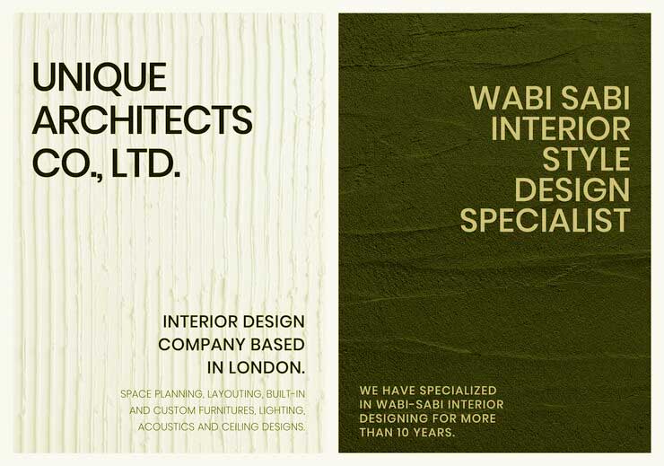
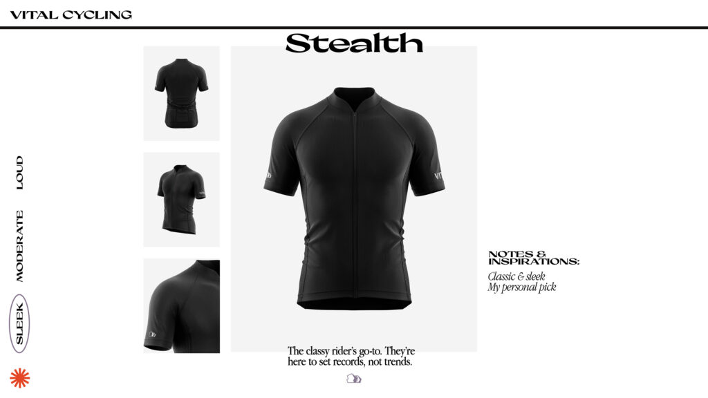
Clean lines, neutral colors, and limited use of elements often characterize minimalist designs. Minimalism aims to create a sense of calm, clarity, and focus.
Examples of Minimalism in Design
• The logos of Google, Apple, and Nike.

• The web designs of Airbnb, Spotify, and Pinterest.

Characteristics of Minimalism in Design
- Minimalist designs are simple and uncluttered.
- Minimalist designs are functional and effective. Every element in a minimalist design has a purpose and serves a function.
- Minimalist designs often feature clean lines and geometric shapes. This creates a sense of order and balance.
- Minimalist designs often use neutral colors like white, black, grey, and beige. This creates a sense of calmness.
- Minimalist designs often hold negative space. Negative space is the space around and between the elements of a design. It can be used to create a sense of focus and importance.
Advantages of Minimalism in Design
Versatility: From logos and branding to website design and product packaging, minimalist designs can be applied in many contexts. Additionally, they work well for a variety of industries and audiences.
Timelessness: minimalist designs are frequently timeless and never go out of style because they focus on essential elements and avoid trends.
Cost-effectiveness: Minimalist designs can be more cost-effective to produce than complex designs. This is because they need fewer elements and resources.
Maximalism in Design
Maximalism is the opposite of minimalism. It is a lavish, luxurious, and visually stimulating design style. Using various styles, vibrant colors, patterns, and textures are typical elements of maximalist designs. Maximalism aims to create a feeling of excitement, energy, and uniqueness.
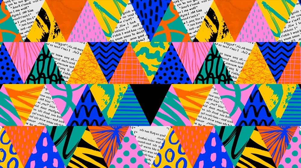
Maximalism can be used in every design area, from fashion and interior design to graphic design and web design. It is a popular style for companies and brands looking to convey a feeling of boldness, joy, and creativity.
Example
Room Interior
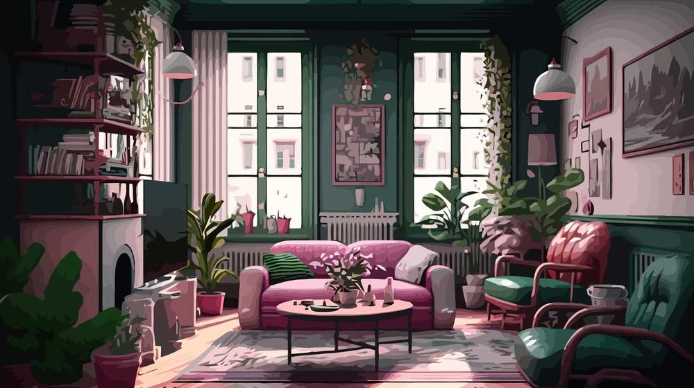
Characteristics of Maximalism in Design
- Colorful hues: Bold and colorful colors are frequently used in miximalist designs.
- Combination of styles: Maximalist designs frequently combine several styles. This might involve global, modern, and traditional designs.
Advantages of Maximalism in Design
- Personal expression: Maximalist designs frequently show the individuality and sense of style of the designer.
- Emotional depth: rich narrative and incorporating several levels of meaning are made possible by maximalism.
- Personalization: A high degree of personalization and customization is possible with maximalism, which benefits projects that showcase unique brand identities or personalities.
Choosing the right approach
To choose which approach to apply, consider the following:
Audience:
Take into consideration your target audience’s preferences and expectations. While some people would value maximalism’s richness and complexity, others could favor minimalism’s clarity and simplicity.
Message
Consider the point you want to make. Does the message call for a bold and lavish presentation, or is it one of clarity and simplicity?
Content
The type of content you have may influence your decision. Maximalist features may benefit artistic and informative content, while minimalism frequently helps clarify highly technical or factual text.
Brand Identity
Make sure your design is consistent with the identity and values of the brand if it is intended for a particular brand.
Combining elements of both styles
The nature of the project, the intended audience, and the message determine the choice between minimalism and maximalism in each instance.
To develop a distinctive and well-balanced style that fits their goals and brand identity, designers may also combine aspects of the two methods.
Typography

Regarding graphic and web design, choose maximalist fonts for bold headings and other significant elements. On the other hand, use minimalist fonts for body text. This method can produce a visually appealing hierarchy.
Branding and logo design
You must use maximalist elements in your logo for extra or decorative characteristics but keep the primary components minimalist. This balance can be used to communicate both simplicity and uniqueness at the same time.
Website and UI
Use a minimalist layout and navigation structure for clarity and ease of use. However, incorporate maximalist elements, such as vibrant color highlights or engaging animations, to add visual interest and engagement.
Adopting the design approach based on the project
Selecting the best design approach for a project depends on the project’s objectives, content, and target audience. Here are the guidelines for choosing between minimalism and maximalism in design:
Branding and Logo design
Minimalism:
This strategy works well for brands that want to create a feeling of efficiency, elegance, and modernism. A prominent illustration of this would be Apple’s logo, which has an apple with a bite out of it and is instantly identifiable due to its simple design.
Maximalism
Miximalist branding adopts a bolder, more expressive style with vivid colors, minute details, and complex patterns. Maximist logos, like those of Versace, are recognizable for their Medusa head encircled by decorative components, giving them a rich and excessive appearance.
Web Design and User Interface (UI):
Minimalism
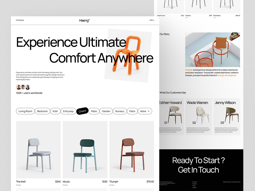
Minimalist web design prioritizes usability, clarity, and a clean user experience. It frequently has a lot of white space, easy navigation, and readable font. With its simple search bar and logo, Google’s homepage is an excellent example.
Maximalism
If impact and engagement are the main objectives of a website, maximalist web design can be applied to innovative or aesthetically attractive websites. For instance, the official “Spider-Man: Into the Spider-Verse” website employs maximalist design elements to engross visitors and transport them to the film’s universe, including vivid colors and animated images.
To sum up, no matter which style you choose, the most important thing is to create a design that is visually appealing, functional, and effective in communicating your message.
-
Generate Vector Graphics from a Detailed Text Description in Illustrator
Generate Vector Graphics from a Detailed Text Description in Illustrator in 2024 The Text to Vector Graphic Generate (beta) function in Illustrator can…
-
Best Adobe Illustrator Plug-in for Selections
Adobe Illustrator is a powerful tool for graphic designers and artistic professionals. It offers countless plugins that take your illustration skills to new…
-
Identify fonts from images using Retype (beta) in Illustrator
Identify fonts from images using Retype (beta) in Illustrator in 2024 Find font from images option is now available in Illustrator (Beta), which…
